Many “wrong color” regrets aren’t about the color itself—they’re about lighting. A paint color can look perfect in a store and completely different at home because rooms have different exposure, different bulbs, and different surrounding finishes (floors, cabinets, countertops).
This guide provides a practical way to choose interior paint colors with fewer surprises, using lighting checks and a simple testing plan.
Quick takeaways
- Lighting is the #1 variable. Room exposure and time of day change how color reads.
- Undertones matter more than the color name. “Warm gray” can still lean green or purple.
- Test on the wall, not just a chip. Large samples show what the room will feel like.
- Sheen changes color perception. More sheen reflects more light and can shift how a color reads.
1) Start with the goal (not the paint chip)
Before choosing a specific color, define the room’s goal:
- Bright and airy
- Cozy and warm
- Crisp and modern
- Calm and neutral
Then list what’s staying in the room:
- Flooring (wood tone, vinyl tone, tile tone)
- Cabinets (if applicable)
- Countertops and backsplash (if applicable)
- Major rugs and upholstery
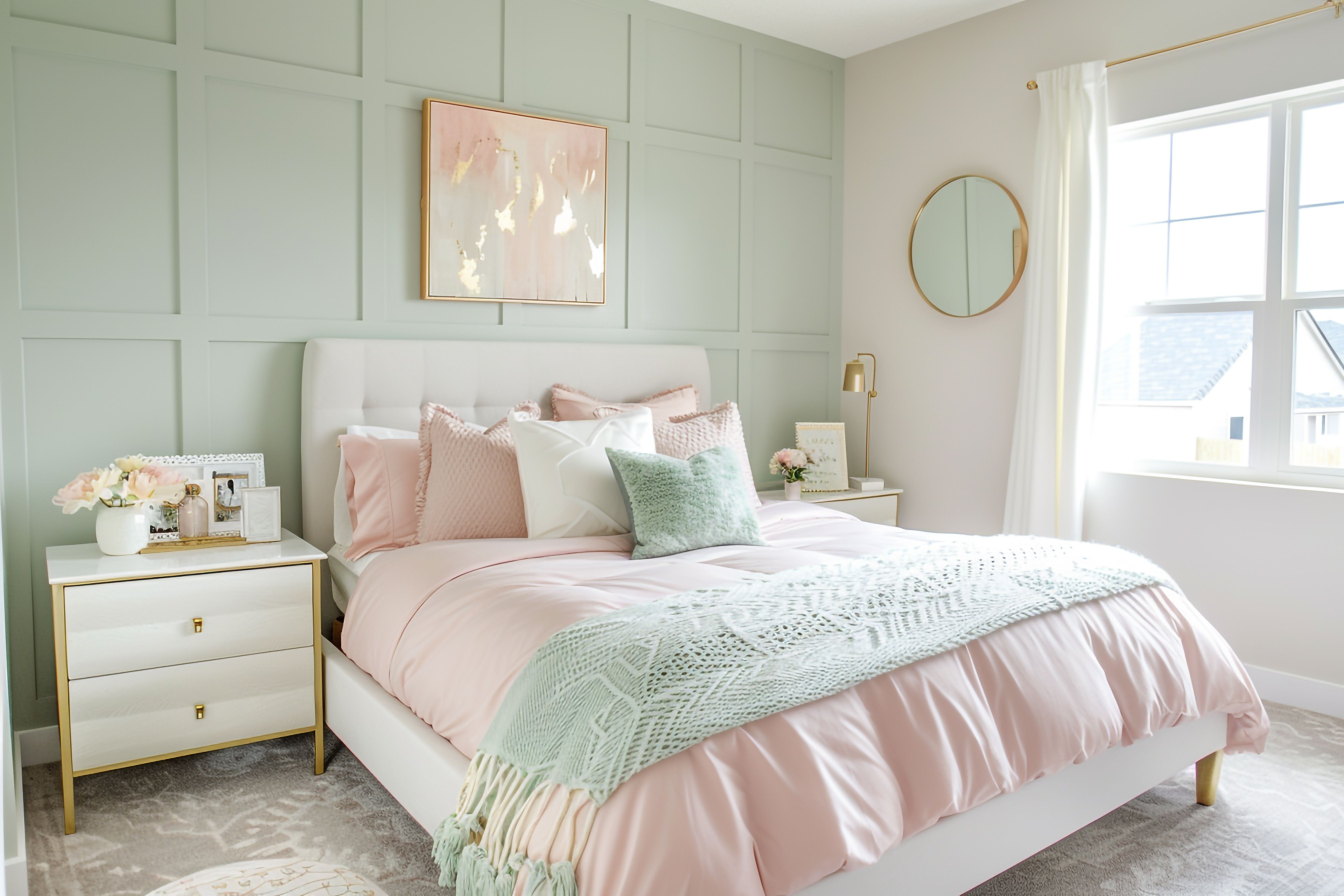
Paint should harmonize with these fixed elements.
2) Understand exposure: north, south, east, west
Exposure affects color more than most people expect:
- North-facing light often feels cooler and dimmer. Colors can read more muted or gray.
- South-facing light is often brighter and can make warm colors feel warmer.
- East-facing light changes sharply from morning to afternoon.
- West-facing light often feels warmer later in the day and can make warm colors glow.
If you can, evaluate colors at multiple times: morning, midday, evening.
2a) Artificial lighting: bulbs and fixtures can shift color a lot
Even if a room has great daylight, you live in the room at night. The same paint can look noticeably different under different bulbs and fixtures.
Practical lighting checks before you commit:
- Warm vs. cool bulbs: warmer bulbs can make neutrals look warmer and more creamy; cooler bulbs can make the same neutral look more gray.
- Mixed lighting: a room with multiple bulb types (overhead, lamps, under-cabinet) can make colors look inconsistent across walls.
- Directional lighting: fixtures that wash light across a wall can highlight texture and make sheen more noticeable.
If you are changing bulbs or fixtures, do it before final color selection when possible. At minimum, test samples with the lighting you actually plan to use most nights.
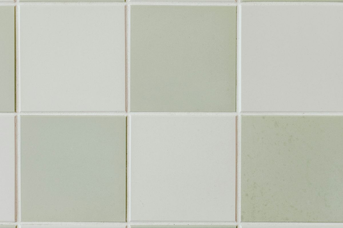
3) Undertones: the hidden color that shows up later
A “neutral” paint often has a subtle undertone:
- Green
- Blue
- Purple
- Pink
- Yellow
Undertones show up next to other materials. Example: a gray that looks neutral on a white card can lean green next to warm wood floors.
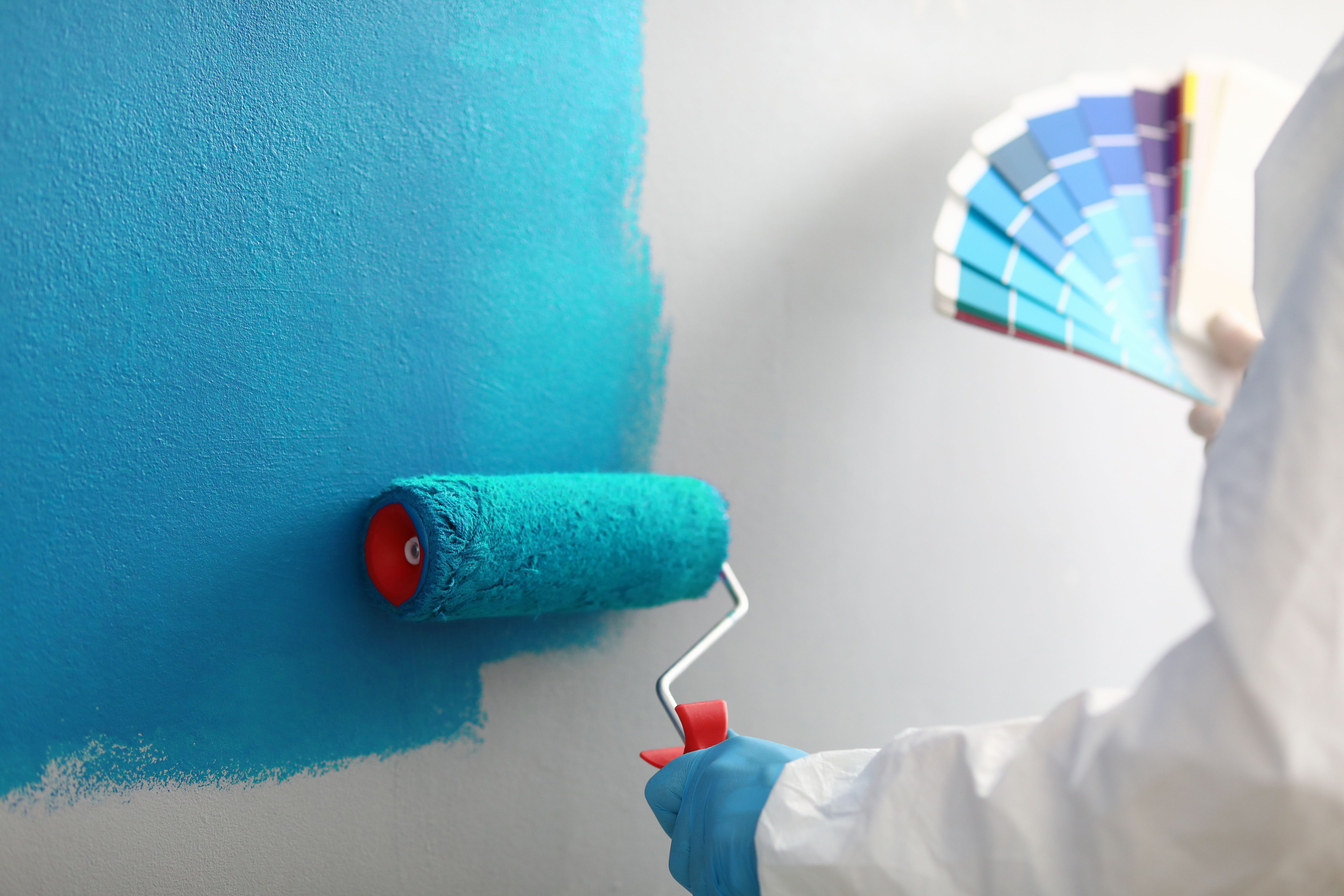
When comparing swatches, don’t compare one at a time. Compare two or three similar options side by side—undertones become obvious when you do.
4) Don’t skip the sheen decision
Sheen changes how light interacts with color:
- Higher sheen reflects more light and can make colors look brighter (and can show more wall texture).
- Lower sheen diffuses light and can make colors feel softer.
If you’re choosing between two similar colors, sheen can be the deciding factor. This guide explains the practical trade-offs: Paint sheen guide.
5) Sample strategy that actually works
Instead of painting tiny squares, use large samples:
- Put a large sample on the wall (two locations if the room gets different light).
- Observe it in the morning and at night.
- Compare it next to trim and flooring.
If you’re deciding between three colors, test all three at once. Seeing them together makes it easier to eliminate “almost right” options.
5a) Make your samples more accurate (avoid the common mistakes)
Testing works best when you remove variables:
- Test next to a true white reference. Hold up a sheet of white paper near the sample. Undertones show faster with a neutral reference.
- Avoid testing right next to strong colors. A bright rug, artwork, or a colorful couch can shift how you perceive a sample.
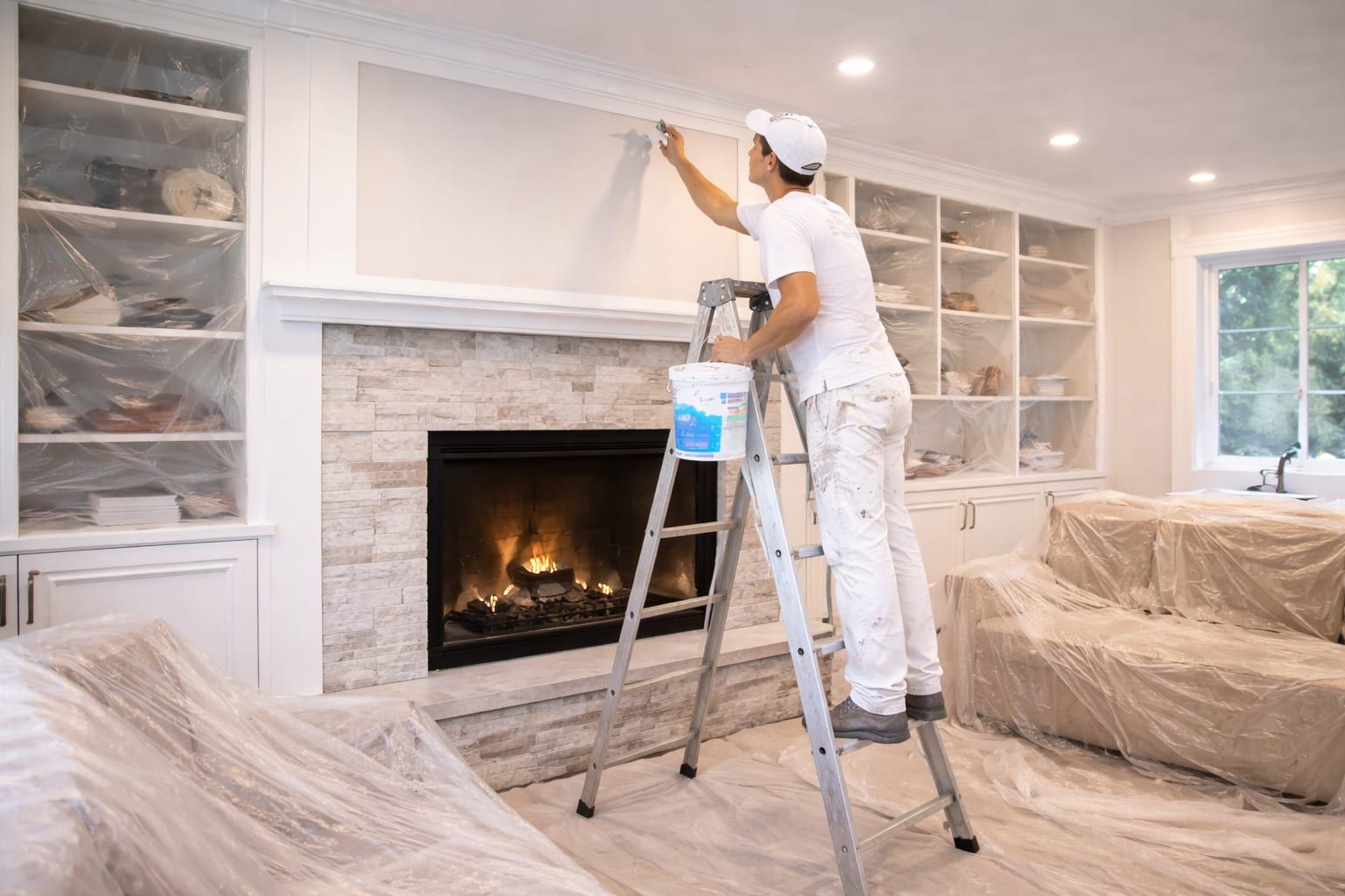
- Prime where needed. If the existing wall color is very strong, it can influence a sample and make it look wrong.
- Use a sample board if you want flexibility. Painting a movable board lets you test the same color in different rooms and different light without repainting walls.
The goal is not perfection. The goal is reducing the risk of a full-room repaint because the color felt different in your home than it did on a chip.
6) Use the “two walls and a corner” test
Colors shift around corners. A practical test is:
- One large sample on the main wall
- One large sample on an adjacent wall
- A small amount wrapped around a corner
This shows how color reads in different angles and light.
7) Consider adjacent rooms and sightlines
Paint colors don’t live in isolation. If you can see into the next room, colors influence each other. Helpful planning questions:
- Do you want a consistent neutral across multiple rooms?
- Do you want subtle shifts (same family, slightly different depth)?
- Do you want defined transitions (more contrast room to room)?
If the home is open concept, a simpler palette often looks more intentional and is easier to maintain.
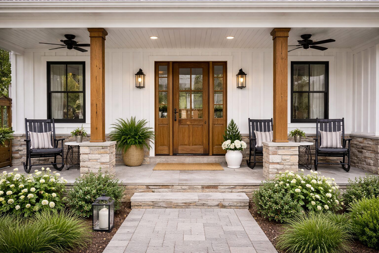
8) Trim color and “white” decisions
Trim “white” is not just white. Whites can lean:
- Cool (blue/gray)
- Warm (yellow/cream)
- Neutral
Your trim choice affects how wall colors read. If trim is very cool white, warm wall colors can look warmer. If trim is warm, cool wall colors can look cooler by comparison.
If you’re repainting trim, plan sheen and color together to avoid mismatch: Interior painting prep checklist.
9) A simple way to choose a neutral
If you’re overwhelmed by options, use a staged approach:
- Pick a neutral that complements your fixed finishes (floors, cabinets).
- Choose “depth” (how light or dark) based on the room’s light and your preference.
- Confirm undertone by testing in the room.
Then use that neutral as a base across the home. Accent colors can be added later.
9a) Depth matters: light vs. dark and how it changes the room
Two colors with similar undertones can still feel very different because of depth (how light or dark they are).
Practical effects to consider:
- Lighter colors: can make small rooms feel larger and brighter, but they can also reveal wall texture in strong light.
- Darker colors: can feel cozy and intentional, but they usually show dust, fingerprints, and touch marks more in high-traffic areas.
- Contrast with trim: a higher contrast between wall and trim can feel crisp and modern; low contrast can feel softer and more blended.
If you are unsure, start with a middle depth neutral, test it in the room lighting, then adjust lighter or darker from there.
10) Accent walls and bold colors: how to reduce risk
Bold colors can look great, but they increase the chance of regret if you choose them based on a small swatch. If you want an accent:
- Choose a wall that makes sense architecturally (natural focal wall)
- Consider how lighting hits that wall
- Test a large sample (bigger than you think)
Also remember that bold colors sometimes require additional coats to cover well, which can affect timeline.
11) Color and finish coordination with other projects
Paint decisions often overlap with:
- New flooring (vinyl, tile)
- New cabinets or cabinet installation
- Door replacement (new door style changes the “feel” of a color)
If multiple finish projects are happening, sequencing and coordination reduce rework: Our process.
12) FAQs
Why does the color look different at night?
Bulb type and direction change color perception. Warm bulbs can make neutrals look warmer; cool bulbs can make them look more gray.
Is it better to choose color first or sheen first?
Often sheen and color should be chosen together. If you’re unsure, pick the use case first (durability vs. hiding flaws), then narrow color options.
How many samples should I test?
Usually two or three is enough. Testing too many can create decision fatigue. Compare the top contenders side by side.
Should I test samples in multiple rooms?
If you plan to use the same color across multiple rooms, testing in more than one room is a good idea. Exposure and lighting can differ room to room, so a color that feels perfect in one space may feel cooler or warmer in another.
Next steps
- Painting service details: Painting
- Sheen planning: Paint sheen guide
- Start a quote request: Request a quote
Need help planning the next step?
Share photos and rough measurements to get a clear yes/no on fit and the right follow-up.