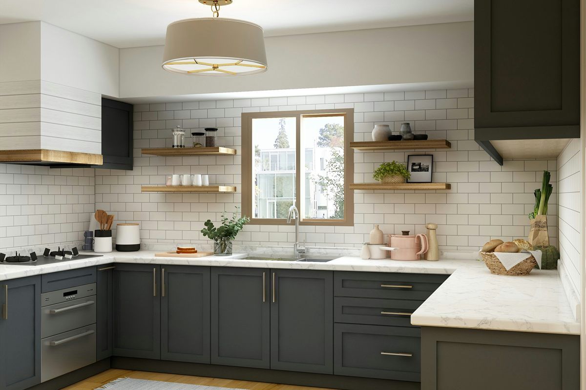
Grout is not an afterthought. Grout color and grout joint width shape the finished look just as much as the tile itself. The right grout choice can make a surface feel calm and seamless—or intentionally graphic and high-contrast. It also changes maintenance: what hides everyday grime, what shows splashes, and what’s easiest to keep looking good over time.
This guide walks through grout color and joint width decisions in a practical way, with examples and a simple decision framework you can use before ordering materials.
Quick takeaways
- Grout color sets the visual tone. Matching grout minimizes the grid; contrasting grout highlights the pattern.
- Joint width is both design and tolerance. Tighter joints look crisp but demand more precision.
- High-contrast grout is less forgiving. If you want bold contrast, layout and line quality matter more.
- Maintenance matters. Very light grout can show staining; very dark grout can show residue in some environments.
1) Decide what you want the surface to “read as”
Start with the overall look goal:
Seamless and calm
Choose a grout color that’s close to the tile body color so the tile reads as one continuous surface. This works well when you want:
- A clean, modern look
- Large tile to feel like a single plane
- Less attention on grout lines
Balanced and timeless
Choose a grout color that’s slightly lighter or darker than the tile. This gives definition without turning the surface into a grid.
Graphic and high-contrast
Choose a grout color that clearly contrasts with the tile (white tile with dark grout, dark tile with light grout). This can look great, but it’s less forgiving:
- Every line is visible
- Small alignment differences show more
- Cleaning expectations should be realistic
If you’re planning a backsplash, grout decisions should happen at the same time as layout decisions: Tile backsplash planning.
2) Grout color: what you see in the room can differ from the swatch
Grout color can shift based on:
- Lighting (warm bulbs vs. daylight)
- Surrounding finishes (wood floors, painted cabinets)
- Tile texture and reflectivity (matte vs. glossy)
If you can, evaluate grout colors in the actual room lighting. Even holding a grout sample next to the tile in the room can reveal undertones you don’t notice under store lights.
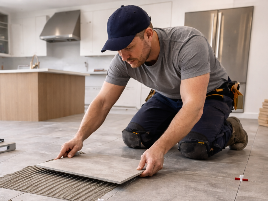
2a) Test grout with the tile (a small mockup can save a big surprise)
Grout often looks different once it is spread across a surface and fully dry. If you want more confidence before you commit, do a small test:
- Lay out a few spare tiles on a board or scrap surface.
- Use spacers that match your planned joint width.
- Apply a small amount of grout and clean it the way you would on the real job.
- Let it dry fully, then look at it in the room lighting (day and night).
This does two useful things:
- It shows how the grout color reads next to your exact tile (including the tile texture).
- It shows how much the grout lines will “grid” the surface at your chosen joint width.
If you are choosing between two grout colors, mockups make the difference obvious.
3) Light grout: bright and classic (with realistic maintenance)
Light grout pairs well with white tile and brightens small spaces, but it can show:
- Cooking residue (backsplashes)
- Soap and mineral buildup (bath areas)
- Dirt in high-traffic zones (floors)
Light grout can still be a smart choice if you want a clean look and you’re comfortable with periodic cleaning.
4) Medium grout: the “forgiving” middle
Mid-tone grout is often a practical sweet spot:
- Provides definition without heavy contrast
- Hides everyday grime better than very light grout
- Works with many tile colors and styles
If you’re unsure where to start, mid-tone grout is often the least risky choice.
5) Dark grout: bold and modern (and not always “low maintenance”)
Dark grout can hide certain stains, but it can also show:
- Light mineral residue (especially in wet environments)
- Soap film in bathrooms
Dark grout is also high contrast on light tile, which makes layout and line quality more noticeable.
5a) Cleaning and sealing: set expectations before you choose a color
Grout maintenance depends on the tile area and the products used. A few practical points help:
- Grout haze is real. High-contrast grout can leave visible haze on tile faces if cleanup is rushed.
- Cleaners matter. Some strong cleaners can discolor grout over time. Following tile and grout care guidance helps the finish stay consistent.
- Sealant decisions vary. Some grout systems are designed to resist staining better than others. The important part is having a plan for keeping the surface looking good, especially in kitchens and baths.
If your goal is “looks good with less stress,” mid-tone grout is often a safe place to start.
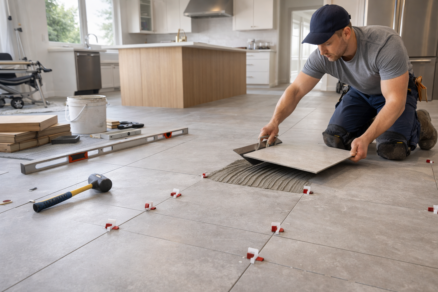
6) Joint width: design + tolerance + tile consistency
Joint width isn’t chosen in a vacuum. It depends on:
- Tile size
- Tile edge style (sharp edge vs. pillowed edge)
- How consistent the tile is (some tiles vary more)
- How flat and square the surface is
Tighter joints can look premium, but they can also be less forgiving if tile varies slightly.
6a) Grout type affects the finished look (and the install experience)
Grout is not one single product type. The type of grout used can affect:
- How smooth the joint looks
- How the color reads after it dries
- How the grout handles movement and cleaning over time
Without getting overly technical, the key is that joint width and tile type influence what grout is appropriate. Some grouts are better for very small joints, and others are designed for wider joints or higher performance needs.
If you are comparing grout options, ask two practical questions:
- “Is this grout designed for my joint width?”
- “What is the recommended cleaning and curing approach so the color stays consistent?”
Following the grout manufacturer’s directions matters more than most homeowners expect, especially when you choose high-contrast grout where haze or uneven color stands out.
7) Tile type influences what joint width makes sense
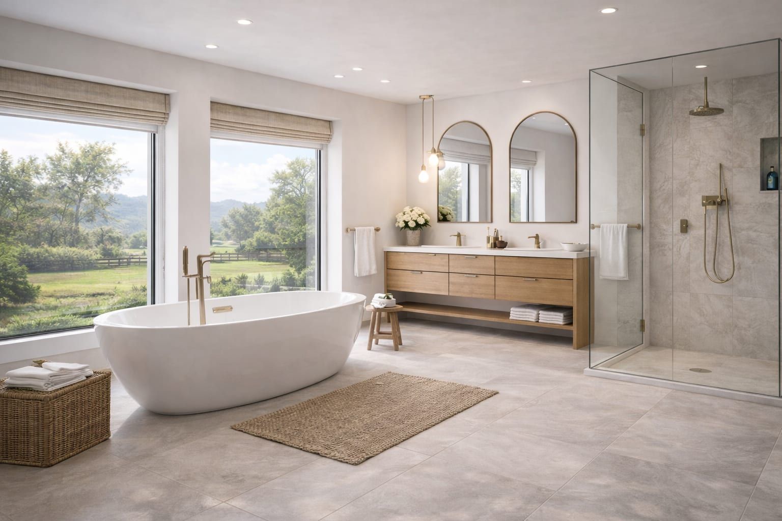
Ceramic and porcelain
Many ceramic and porcelain tiles are consistent enough for tighter joints, but it depends on the specific product line.
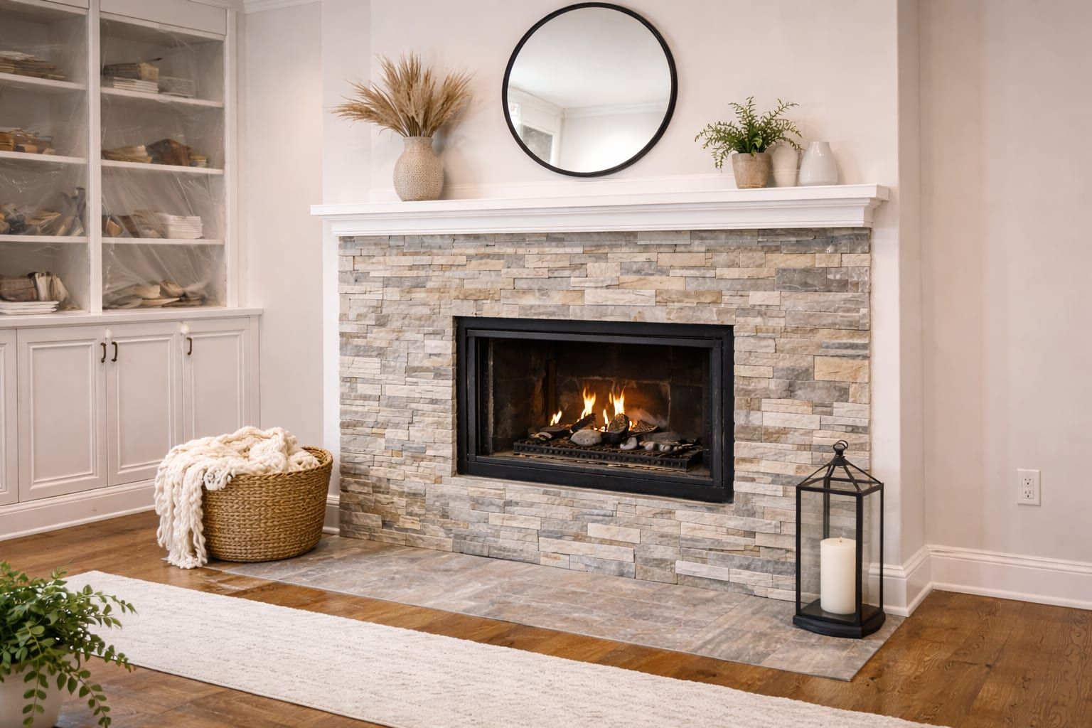
Natural stone
Stone can vary more and may look better with a slightly wider joint that feels intentional and balanced.
Mosaics and small format
With mosaics, grout is a larger percentage of what you see. Grout color can make mosaics feel:
- Calm and blended (matching grout)
- Busy and patterned (contrasting grout)
Sheet-to-sheet alignment also matters more than people expect.
8) Surface prep matters: grout doesn’t fix uneven tile
Grout is the finish step. If the surface isn’t flat enough or tile isn’t aligned well, grout can’t hide it—especially with high-contrast grout.
On floors, flatness and subfloor prep drive grout line quality and lippage risk: Tile subfloor prep and flatness.
9) Changes of plane: where grout often isn’t the right finish
Areas like wall-to-wall corners and wall-to-counter joints tend to move. Many tile assemblies use a flexible sealant in those joints rather than rigid grout to reduce cracking. The important part is making the line straight, consistent, and visually clean.
10) A simple decision framework (in order)
- Pick the tile.
- Choose the overall visual goal (seamless, balanced, graphic).
- Confirm joint width that matches tile and surface realities.
- Choose grout color in the actual room lighting if possible.
- Confirm edge details so grout lines end cleanly.
11) FAQs
Should grout match the tile or match the countertop?
Usually grout is chosen to match or complement the tile field. Countertops can influence the choice, but grout lives with the tile.
Are very small grout joints always better?
Not always. Tight joints can look great, but they demand consistent tile and a surface that supports that precision.
Does darker grout always stay cleaner?
Not necessarily. Dark grout can hide stains but may show residue. Choose based on the space and realistic maintenance.
Should I match grout across multiple rooms?
If rooms connect and you can see the tile fields together, consistent grout can help the home feel cohesive. If rooms are separate, it is fine to choose grout that fits each room’s tile and lighting. The best choice is the one that looks intentional in your sightlines.
Next steps
- Service overview: Tile installation
- Plan a backsplash with grout in mind: Tile backsplash planning
- Share your tile and grout goals: Request a quote
Need help planning the next step?
Share photos and rough measurements to get a clear yes/no on fit and the right follow-up.